Appearance Mode Changer
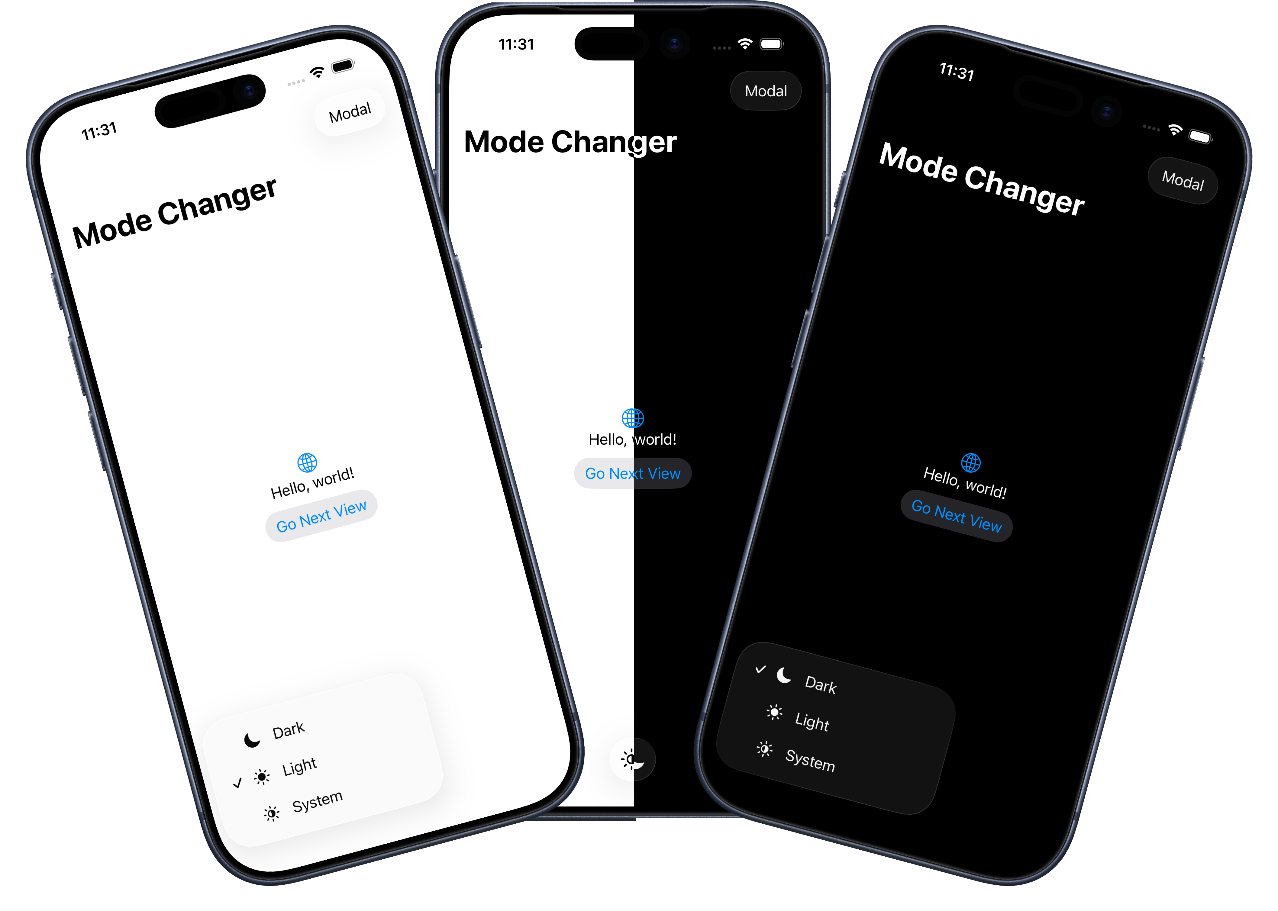
Creating an Appearance Mode Picker in SwiftUI
Many apps give users a simple choice for how the interface should look:
- Follow the system appearance
- Always use light mode
- Always use dark mode
SwiftUI makes this surprisingly easy. The trick is to model the choice once, save it with @AppStorage, and apply it at the root of your app with preferredColorScheme.
In this post, we will build an appearance mode setting that can be reused in almost any SwiftUI application.
The Goal
We want the user to choose an appearance mode from inside the app. Once selected, the app should update immediately and remember that choice the next time it launches.
The finished behavior looks like this:
Systemfollows the device's current light or dark mode setting.Lightforces the app to use light mode.Darkforces the app to use dark mode.- The selected value persists across launches.
- Navigation views and modal sheets inherit the selected appearance.
Create the Appearance Mode Type
Start by creating an enum to represent the three supported modes.
import SwiftUI

enum AppearanceMode: String, CaseIterable, Identifiable {
    case system
    case light
    case dark

    var id: Self { self }

    var title: String {
        switch self {
        case .system:
            "System"
        case .light:
            "Light"
        case .dark:
            "Dark"
        }
    }

    var iconName: String {
        switch self {
        case .system:
            "sun.righthalf.filled"
        case .light:
            "sun.max.fill"
        case .dark:
            "moon.fill"
        }
    }

    var colorScheme: ColorScheme? {
        switch self {
        case .system:
            nil
        case .light:
            .light
        case .dark:
            .dark
        }
    }
}
There are a few useful details here.
CaseIterable lets us build a picker by looping over all cases. Identifiable makes the enum convenient to use in ForEach. The title and iconName properties keep display details close to the option they describe.
The most important property is colorScheme.
var colorScheme: ColorScheme? {
    switch self {
    case .system:
        nil
    case .light:
        .light
    case .dark:
        .dark
    }
}
preferredColorScheme accepts an optional ColorScheme. Passing .light or .dark forces that appearance. Passing nil tells SwiftUI not to override the system appearance.
That makes nil the perfect value for the System option.
Save the Selection with AppStorage
Because AppearanceMode is backed by a String raw value, it works well with @AppStorage.
@AppStorage("appearanceMode") private var appearanceMode = AppearanceMode.systemThis stores the user's choice in UserDefaults. When the value changes, SwiftUI updates any view that depends on it. When the app launches again, the saved value is restored automatically.
You can use any key name you like, but keep it stable once your app ships. Changing the key later would make existing users lose their saved appearance preference.
Apply the Appearance at the App Root
The appearance mode should be applied as high in the view hierarchy as possible. In most apps, that means the App entry point.
import SwiftUI

@main
struct MyApp: App {
    @AppStorage("appearanceMode") private var appearanceMode = AppearanceMode.system

    var body: some Scene {
        WindowGroup {
            ContentView()
                .preferredColorScheme(appearanceMode.colorScheme)
        }
    }
}
Applying preferredColorScheme here means the choice affects the whole app, including pushed navigation destinations and presented sheets.
If you apply the modifier deeper in the hierarchy, you may end up with only part of the interface changing appearance. That can be useful for special cases, but for a user-facing app setting, the root is usually the right place.
Add a Picker to the Interface
Now you need a way for the user to change the value.
Here is a simple toolbar menu:
struct ContentView: View {
    @AppStorage("appearanceMode") private var appearanceMode = AppearanceMode.system

    var body: some View {
        NavigationStack {
            VStack {
                Image(systemName: "globe")
                    .imageScale(.large)
                    .foregroundStyle(.tint)

                Text("Hello, world!")
            }
            .padding()
            .navigationTitle("Mode Changer")
            .toolbar {
                ToolbarItem(placement: .bottomBar) {
                    Menu {
                        Picker("Appearance", selection: $appearanceMode) {
                            ForEach(AppearanceMode.allCases) { mode in
                                Label(mode.title, systemImage: mode.iconName)
                                    .tag(mode)
                            }
                        }
                    } label: {
                        Image(systemName: appearanceMode.iconName)
                    }
                }
            }
        }
    }
}
The picker writes directly to the same @AppStorage value. As soon as the selection changes, the app-level preferredColorScheme receives the new value and the interface updates.
Why Use a Menu?
A menu works well when the setting is available from a toolbar. It keeps the interface tidy while still making the choice easy to reach.
For a settings screen, you may prefer a segmented picker or a list row:
Picker("Appearance", selection: $appearanceMode) {
    ForEach(AppearanceMode.allCases) { mode in
        Label(mode.title, systemImage: mode.iconName)
            .tag(mode)
    }
}
The important part is not the picker style. The important part is that every picker binds to the same stored appearanceMode value.
Make Sure Sheets and Navigation Inherit the Mode
Because the color scheme is applied at the app root, child views do not need to know anything about the appearance setting.
struct NavigationStackView: View {
    var body: some View {
        VStack {
            Text("This view was pushed onto the navigation stack.")
            Image(systemName: "star.fill")
        }
        .font(.largeTitle)
        .padding()
        .navigationTitle("Pushed View")
    }
}
Presented sheets also inherit the selected mode:
struct ModalSheetView: View {
    @Environment(\.dismiss) private var dismiss

    var body: some View {
        NavigationStack {
            VStack {
                Text("Presented as a modal sheet.")
                Image(systemName: "apple.logo")
            }
            .font(.largeTitle)
            .padding()
            .toolbar {
                Button(role: .close) {
                    dismiss()
                }
            }
        }
    }
}
These views stay clean because appearance mode is an app-level concern, not a screen-level concern.
The Complete Pattern
The reusable pattern is:
- Create an
AppearanceModeenum. - Store the selected value with
@AppStorage. - Apply
preferredColorSchemeat theApproot. - Bind any picker or settings control to the same stored value.
Once those pieces are in place, you can expose the setting anywhere in your app.
Final Thoughts
Appearance mode is a small feature, but it is one of those details that makes an app feel more considerate. Some users want their apps to follow the system. Others want a specific app to stay light or dark regardless of the device setting.
With SwiftUI, supporting all three options only takes a small enum, a stored preference, and one app-wide modifier.
That is a tidy little feature with a lot of user-facing polish.
If you want to download the code for a sample project using this technique you can find on my GitHub.
